Wait – you mean book covers aren’t perfect the first time around?!
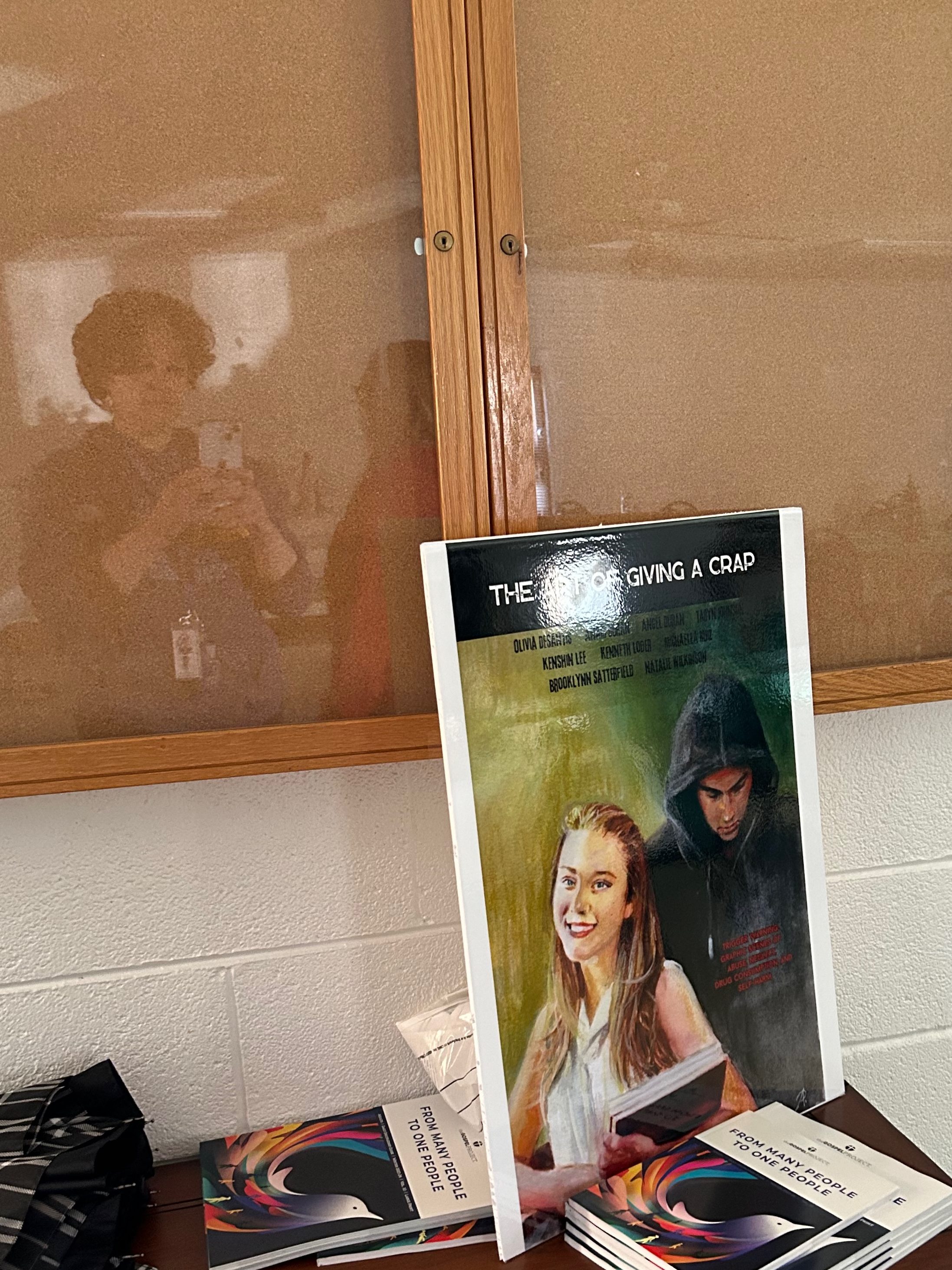
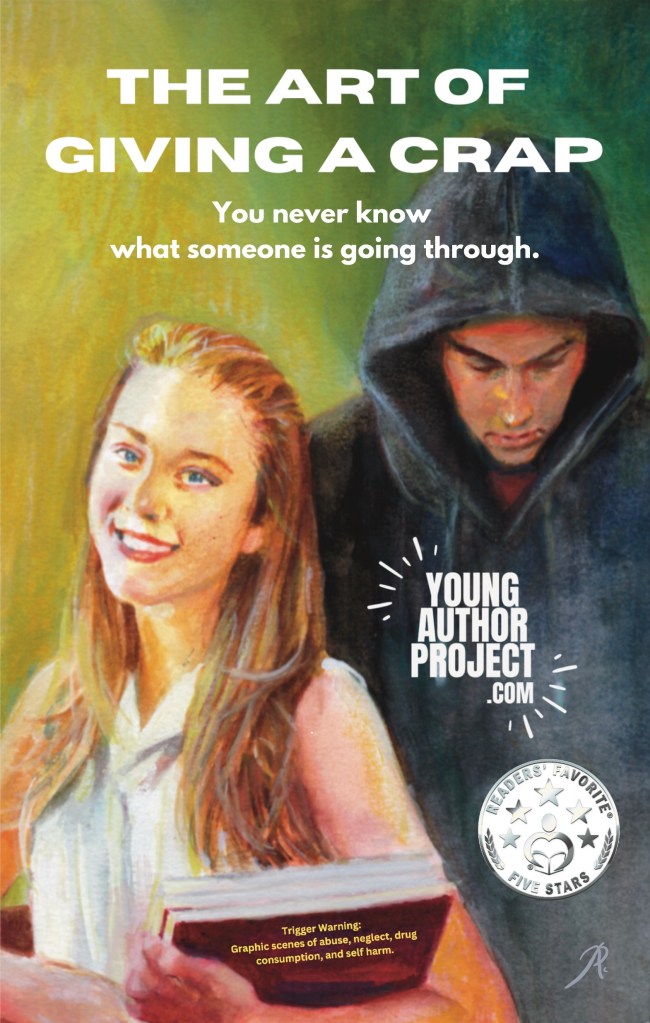
I know, it’s true. Although the artwork was gorgeously crafted by the inimitable Abdon J. Romero, our book cover was not quite done when the first edition was released. The artwork was excellent from day one, of course; it was the text that underwent quite a number of changes as we went along, which I still think is really cool.
Fun fact: the back cover was not even remotely close to done until a couple of months before the title went live on Amazon and Ingram. I don’t have all the precise dates of all the versions, as I’m essentially following the trail of breadcrumbs on Canva and my camera roll. I’ll share the ones I know.
Early Rough Draft
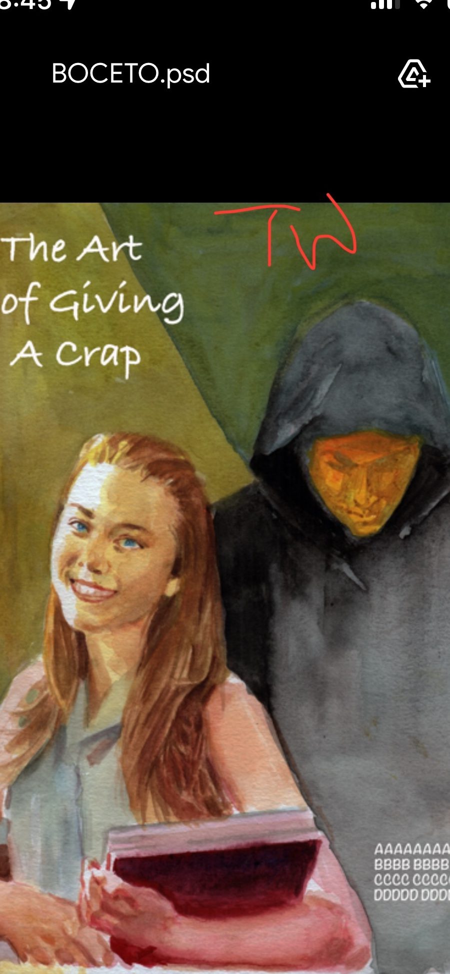
©2023 Young Author Project
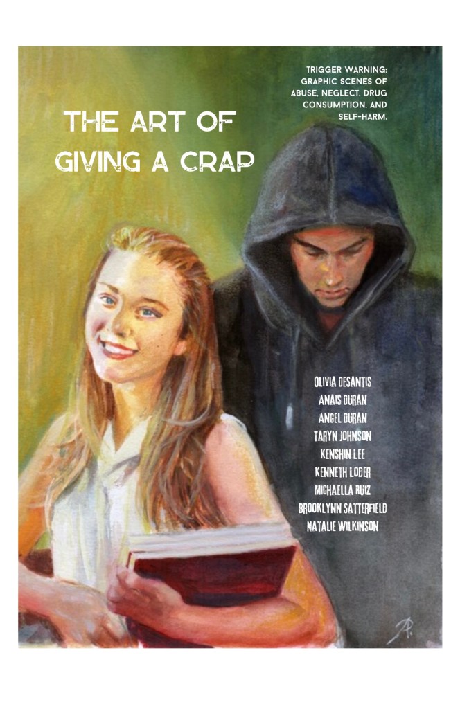
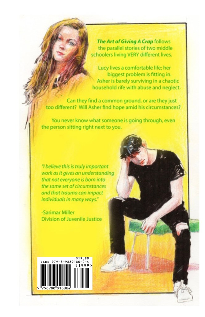
First edition – completed exactly one year ago on December 19, 2023. Crazy!
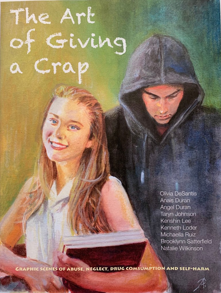
©2023 Young Author Project
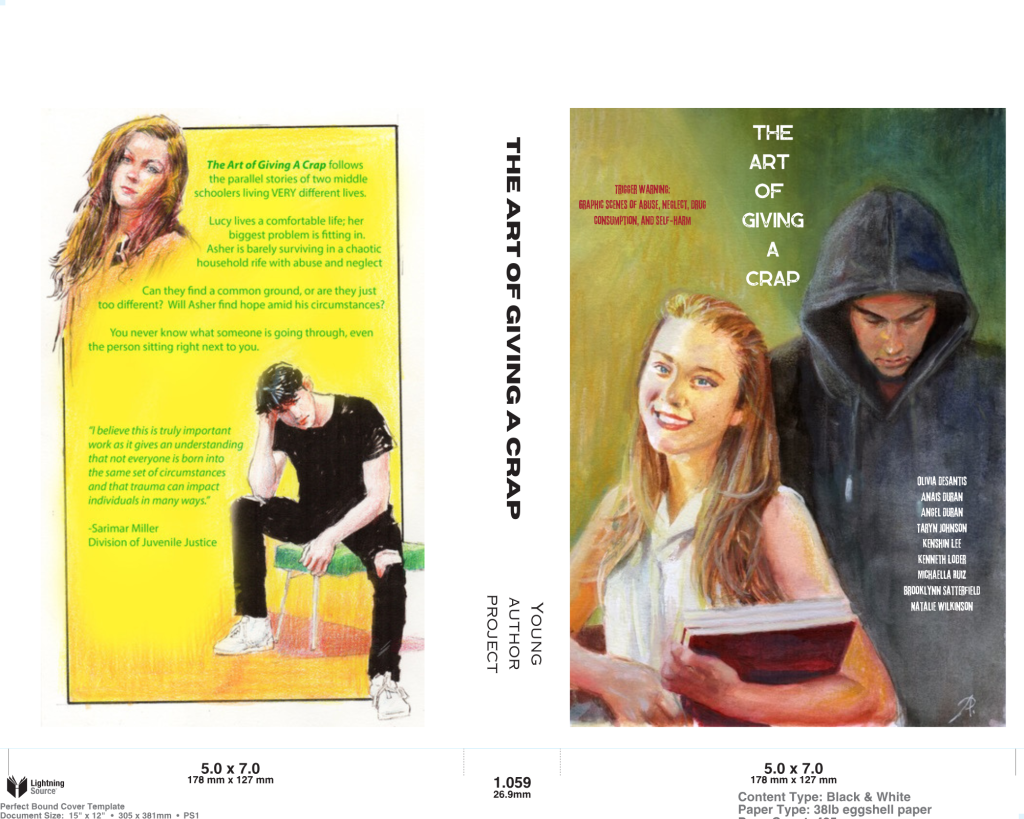
Then I messed it up with this big black stripe in an attempt to improve readability. I was immediately told no, but not before I had it printed for our awards ceremony. Haha. I also changed the fonts in an effort to give the cover an edge, like the story.
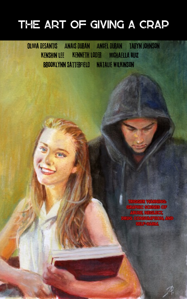
©2024 Young Author Project
©2024 Young Author Project
July 12, 2024
©2024 Young Author Project
IngramSpark provides templates for you to use when putting the book together, which helps a lot when working on ProCreate. Another fun fact: the book was originally slated to be what Reedsy calls “pocket size” (4″ x 6″), but ended up being standard (5″ x 8″), which in my opinion worked very well.
The Homestretch, as seen on Canva:
©2024 Young Author Project
©2024 Young Author Project

©2024 Young Author Project
The Barcode Appears
©2024 Young Author Project
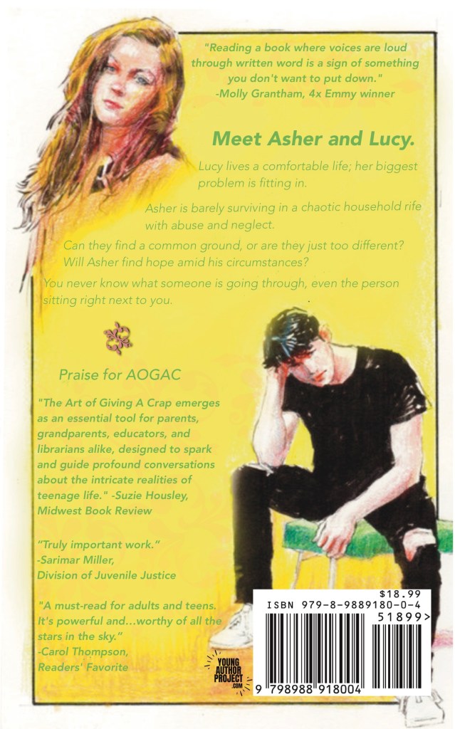
Current version as of December 19, 2024, sporting a shiny new Reader’s Favorite Seal and fresh editorial reviews on the back:
©2024 Young Author Project
©2024 Young Author Project
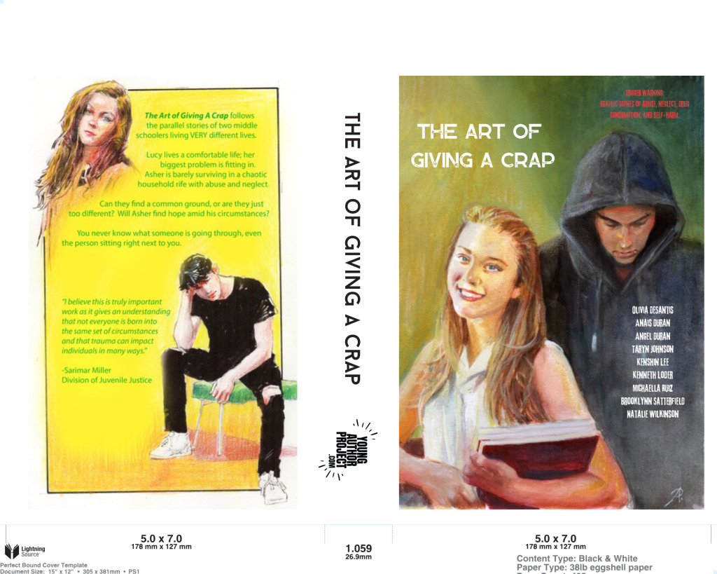
Working with our marketing specialist opened my eyes to what seems obvious to me now: a book cover should be eye-catching and easy to read as a thumbnail. Having everyone’s name front and center was nice in theory, but it wasn’t working from a design perspective. That’s why the logo now represents our team as a collective. (All names are still listed plainly on the inside copyright page, in case you’re wondering.)
If you compare barcodes, the price also dropped by $1 at our marketing guy’s recommendation. (Yep, I had to re-purchase the barcode on Bowker, but it’s fine. If I’m working on a project of this magnitude, I’m doing it well. Ah, all the needless money I spent out of my own pocket on this steep learning curve could make another blog post all on its own, BUT – the important thing is now I know for the next time and everyone still gets their share.)
Don’t you love the scrappy, against-all-odds nature of self-publishing? That’s what makes reaching the finish line all the more satisfying.

Leave a comment